
Case Study: Tagwise

The final layout of the Tagwise Prototype
Tagwise began as the first phase of the Design Lab UX Academy. The initial prompt was to make something useful for people “experiencing a long distance move.” I just recently moved a long distance, so I was initially drawn to this having it been fresh in my memory.

However, it wouldn’t be a good design if it was only designed for myself, so research had to begin. First, gather up as many websites and tools that are already available to see what works, what doesn’t, and what could be improved. Second, card sorting and interview activities with volunteer participants to get more perspective on other people’s unique circumstances. Third and finally, create a persona of the average user and describe a use case scenario.

What we found was that users didn’t always feel they had adequate information about the places they might have to stop along the way. Various considerations such as pets, special needs, dietary and medical, or parking space sizes for larger vehicles was not always convenient to find without having to stop at a gas station and research for several minutes.

With a handful of sketches and a brain full of ideas, I began thinking, plotting, jotting, and before I knew it I had settled on two paths. One would be a voice assistant and the other a quick menu that you could use in one hand and in a vehicle. I felt it was more apt to create the quick menu for the sake of the project. This avenue also would introduce a Wayze like tagging system where users could add information to a location for others to quickly see and understand. Included filter menus could dial in preferences further.
Drawing from various influences and media, I’ve always been a fan of radial interfaces. From the old school iPod wheel to various in game menus, the radial always seemed to me quick and efficient so I decided to try my hand.
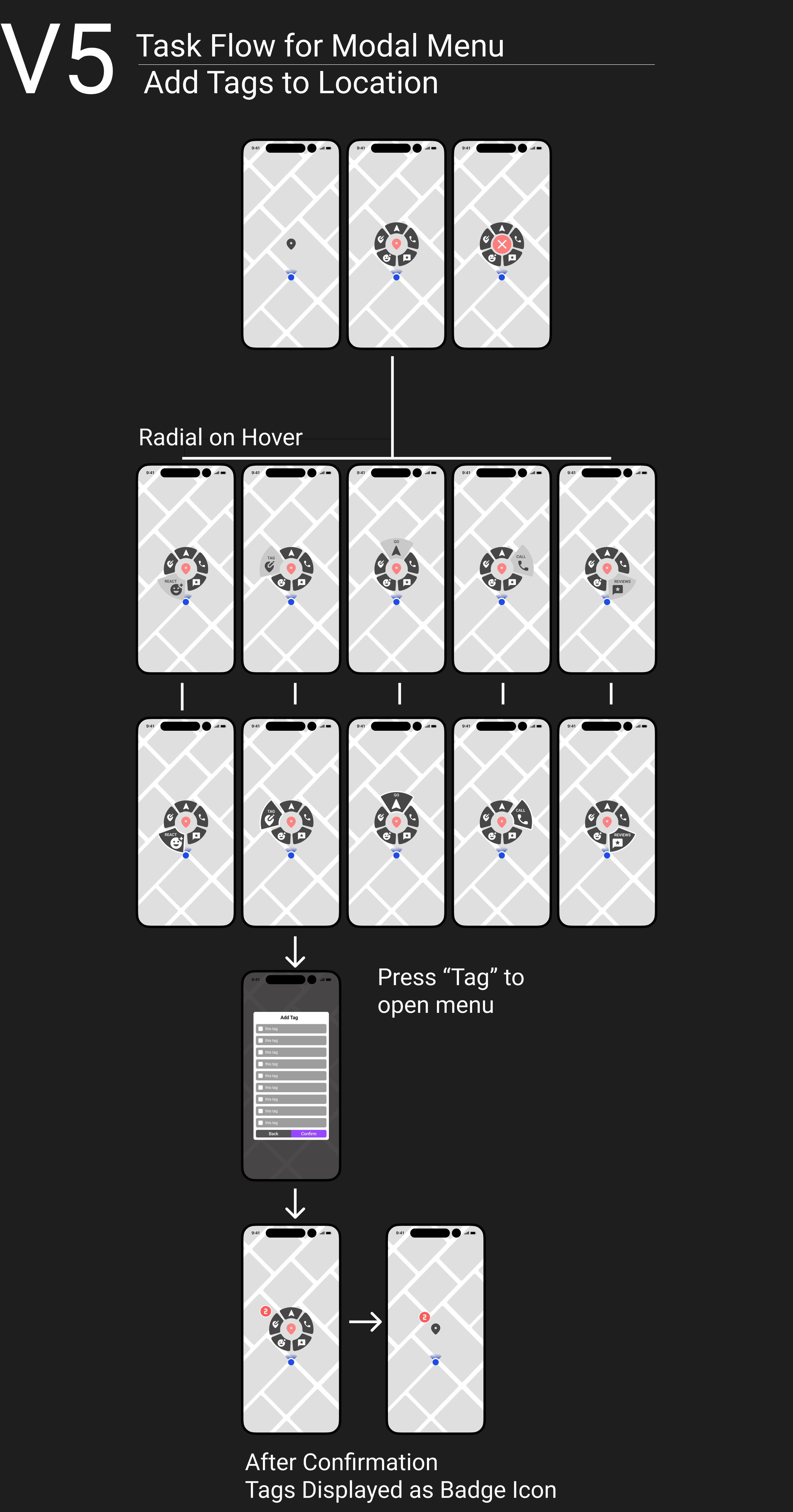
This proved quite challenging, as touch points and scaling were all taken into account. Initial prototypes were reminiscent of the glossy glassy early 2000s Mac styling, but after user testing this design would be simplified. A rounded corner shape felt soft while individual colored petals would give better glance recognition, but ultimately this too was changed to be more cohesive and look less reminiscent of Simon Says.

Once we had a proof of concept, it was time to develop a brand. I decided to use the name Tagwise since the primary mechanism of the system was user generated information. Using the map pin icon, I sketched some ideas of owls using only that shape and ultimately came up with this cute guy. After deciding on a color scheme and font, our simple brand was ready.

User testing proved several flaws in the design, which ultimately led to this final iteration.

Ultimately I am pleased with the outcome though if I had to make any adjustments I think I would maybe refine and give more separation to the Filter menus. I think it would be even better to have each tab category be a different color. You also might notice none of the owl branding is present in the screen shot. Part of this was intentional to keep it clean, but I do feel like a hypothetical final product would incorporate something more.